
MetaLetters is an artist activation program that unites and empowers creators and collectors in the Metaverse – supported by the MetaLettersDAO (decentralised autonomous organisation). It was born as a sub-brand to Metaversal, a creator-first venture studio. As self-proclaimed connoisseurs of culture, they invest in and support artists, non-fungible token (NFT) projects, and companies in Web3. MetaLetters is an extension of this.
The program:
• Educates artists and showcases their work in the Metaverse
• Provides collectors with valuable insight into NFTs
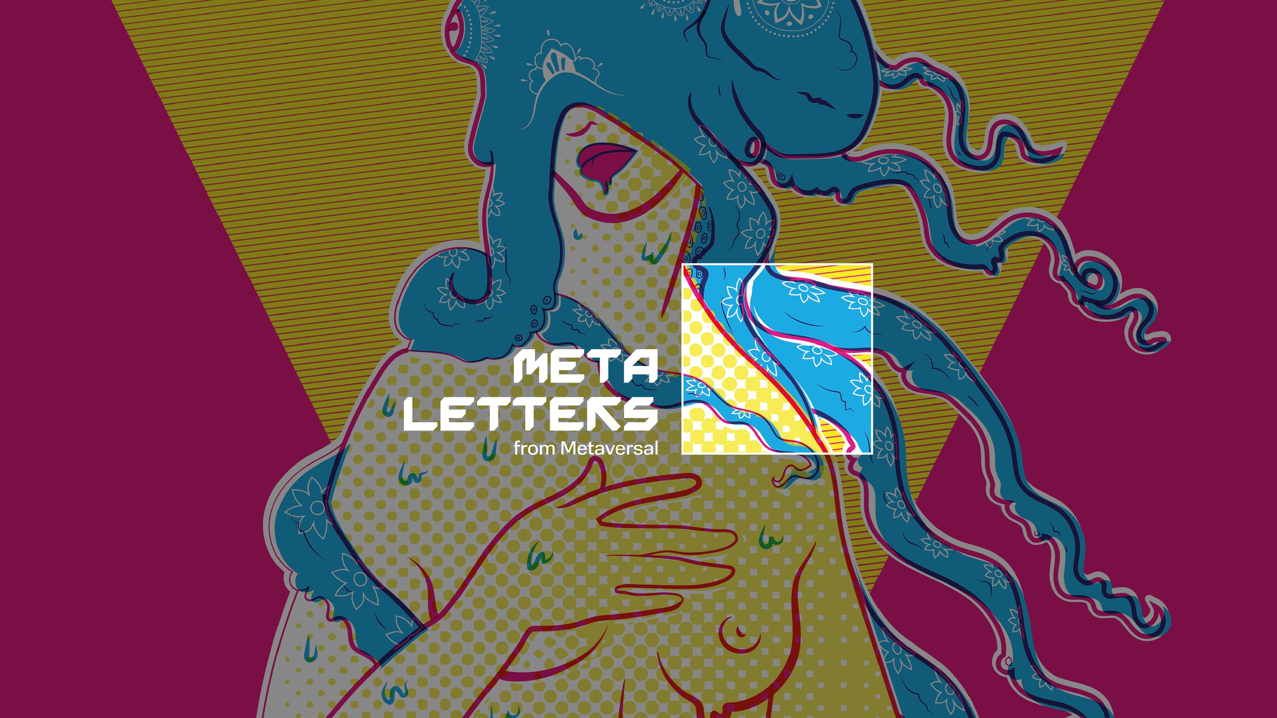
But how does it actually work? “MetaLetters” are one-of-one NFTs of each letter in the word
“Metaversal”. These are designed by various artists, released, and then auctioned.
Developing Metaletters was complex. It shared functions and values with an already established brand. How could we balance this connection and at the same time build an individual identity for MetaLetters? And how could we honour the artists the program was designed for?
Together with the team at Metaversal we created:
• A stand-alone brand identity for MetaLetters that blends with the values and aesthetics of Metaversal
• A visual framework to highlight the NFT artwork of each featured artist
• An exclusive word mark to set MetaLetters apart

“By using the same 16x16 grid to create that logo form it looks and feels like Metaversal”
— Liam


“We wanted to give the art a framework so it would be the center of attention”
— Shannon


Strategy
To formulate a strategy for MetaLetters, we needed to define their values, purpose, and intentions. What did they want to achieve with the brand? Why Web3? To find out, we conducted interviews with the team and founders behind the project. Their intentions were clear.
They wanted a brand with longevity that would provide a platform of support for creators and collectors in the Metaverse. Secondly, to build a network and community. And ultimately, to make Web3 more equitable.
“You want your project to be a success. But it can be a slow process because trust is built over time. You have to remain true to your message over a long period. Then eventually people will care and build that relationship with you.” – Shannon
MetaLetter's duality between artists and collectors also aligned well with Metaversal’s community-first culture. And it embodied the same purpose “to showcase our infinite stories”.
This knowledge springboarded our strategy. With story and artists at the heart of it all and the above understanding, our design team began building the MetaLetters brand and NFT framework.
Design
To do this, we used the same principles from Metaversal to design the MetaLetters sub-brand. The reasons were simple. We needed to emphasise each artist's story and showcase their artwork, and we knew the mechanism that would achieve this. A 16x16 grid system.
Its compacted form acts as a type of framing device for each NFT letter and simultaneously provides each artist with their very own platform.
“What does every piece of artwork need? It actually just needs a frame.” – Liam
On this same thread, we opted for a black and white logo. This colour choice meant that in contrast with the often colourful NFT artworks, the art itself remained the central focus.
Then, we wanted to somehow embody the program’s sense of community building in the design. This influenced our thinking behind the logo form where we combined “M” and “L” letters to create a heart shape. On top of this, the form also ties in nicely to the visual language from Metaversal.
Finally, to ensure that our design was optimised for the digital and Web3 viewing landscape – mobile and social media – we applied an elongated and condensed secondary typeface.
Impact
The result is:
a creator-centered Web3 program with a dynamic and blended brand identity
a framing device to showcase each NFT artwork and artist's story
a word mark logo that sets Metaletters apart and captures its community-first culture
Credit
Project Management: Naledi Mokhele
Strategy and Creative Direction: Shannon Davis
Design: Liam McAlpine
Copy: Carrie Jo Bonduris