
Nox is a luxury real estate company based in Clifton and Camps Bay, Cape Town. With 25 years of experience in the area, their portfolio is filled with premium properties for sale, and long and short term rental. Their expertise and data uniquely position them to provide world-class stays to their guests and investment gains to their partners. In spite of this, few people in the area knew who they were, in an industry where brand recognition is everything.
Their challenge was that their offering was split into two brands, Nox Rentals and Nox Properties resulting in poor brand recognition and little cooperation between the two branches of their staff. In an effort to combat this they approached us to refocus these branches strategically and consolidate them under one refreshed brand.
Our victory condition was to create a brand that would help them stand out as the foremost real estate experts in Clifton and Camps Bay.


“The success of the brand is dependent on the human interface between the technology tool and the customer”
— Nox employee


Strategy
We began by conducting interviews with Nox management, staff, partners and guests to get a better understanding of what makes Nox so special. The findings were surprising, with many agreeing that Nox operates within the luxury hospitality category more than in real estate. Most partners admitted that their most valuable service was vetting and arranging regular guests for short term stays even during the global pandemic.
“Short-term rentals, by default, make you a hospitality business.”
“The success of the brand is dependent on the human interface between the technology tool and the customer…the most important guy in the hotel is the bloody concierge!”
When looking over the answers we got from the interviews it became clear that the people Nox needed to impress were in fact their guests. But how? Well, convincing guests to visit the remarkable homes on offer in their picturesque locations was the easy part. The real differentiation would need to happen through their service, creating unique guest experiences that keep them coming back to Nox properties and in turn, attract more investors.
By proactively managing partners’ properties and by leveraging key transitional moments in their value chain to convert a guest into a partner, Nox would be able to grow their business and awareness sustainably.
To this end we created ‘An experience to…’ as a framing device to define their positioning. As in ‘An experience to remember’, ‘An experience to invest in’ or ‘An experience to live in’.
Design
In looking for a visual representation for these experiences we found none better than the exquisite sunset views on display in the windows and balconies of Nox properties. Our direction was to own the view for Nox, and by extension their partners and guests, to leverage these one-of-a-kind perspectives in every aspect of the Nox identity.
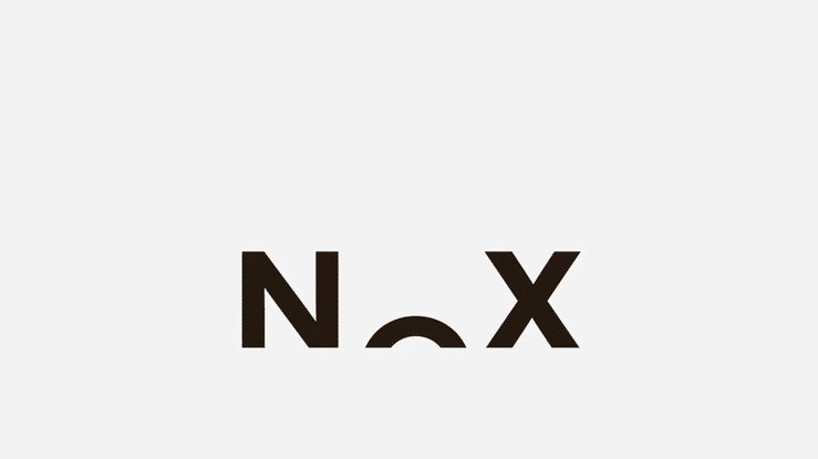
The mark itself was inspired by the rising and setting sun over the sea, subtly cropped by an implied horizon line, putting the view at the very core of their brand. The typeface is Azo Sans, a geometric sans serif with a circular ‘O’ that’s an ideal candidate for the setting sun. It’s nuances soften the strictness of pure geometry, and make it more human than a traditional geometric typeface, reinforcing the human aspects of the Nox brand.
The colours became a palette of gradients inspired by five distinct times of day, namely dawn, sunrise, midday, sunset and night, each offering unique light qualities to draw from. These gradients are each composed of three colours, representing one of Nox’s three core aspects, their guests, their partners and their unique business proposition. Gradients contain a subtle horizon line echoing the line of the sea and have been finished with subtle noise to add atmospheric texture and depth.
Much like the changing hues of the sky over the course of the day, these colours change according to the time. This can be applied literally, for example to the Nox website, changing as the day progresses, or figuratively, for example to ‘for sale’ boards using the sunrise gradient, while ‘sold’ boards use the sunset. These literal colour transitions reflect the transitional moments central to the Nox offering.
It’s easy to think of the expanse of the sky as a wide-angled shot, but for our purposes the most important shift happens vertically. As the sun rises and sets and as the colour of the sky transitions. This elongation likewise stretches their communications’ format, figuratively prolonging the moments around sunrise and sunset which are usually so fleeting. This was applied to everything from narrow business cards to tall ‘for sale’ boards.
Finally even layouts are inspired by the twelve average hours of daylight. Using a twelve row grid that informs each piece of communication.
Impact
With us having produced a positioning and a visual identity that are sure to get them noticed, Nox is poised to become the foremost real estate and hospitality company in the Clifton and Camps Bay area.
Credit
Account Management: Naledi Mokhele
Executive Creative Director: Ross Drakes
Creative Director and Strategist: Sheldon Stewart
Designer: William Rech