

ZARP is a fully audited and certified cryptocurrency stablecoin pegged to the South African Rand (ZAR). It’s managed by Old Mutual Wealth, an esteemed South African financial service provider.
The fintech blockchain project was created as a way to secure compatibility with the rand and future financial systems in Web3.
More companies are attempting to move their brands into Web3 with Decentralised Finance (DeFi) projects. However, they often lack the tools and resources needed to do so successfully.
Unlike most companies, ZARP is backed by trusted and skilled Web3 and financial service providers with all the right tools. Despite this, their branding felt rushed and complex.
They needed a way to simplify their brand, ensure that its functionalities were easy to understand and digitise their brand for Web3 and the blockchain.
Working together with ZARP’s founders, we created a simple, direct, and versatile brand that pays homage to its South African roots while also making sense in a digital landscape. To do this, we created the following:
A visual language and icon (Z) inspired by the composition of the 1 rand coin
A personalised wordmark merging coding language with South Africa’s currency language
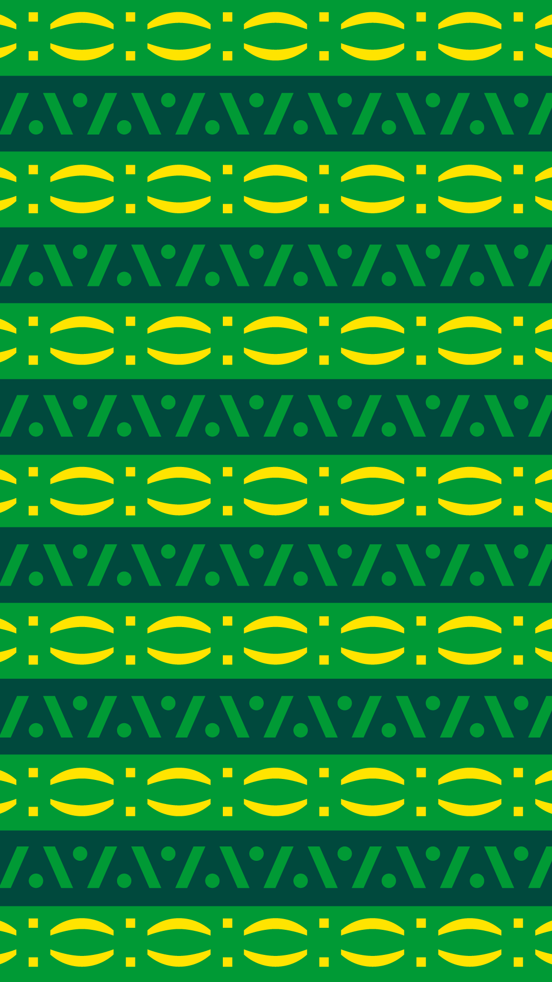
A colour palette representative of both Web3 and inspired by South Africa’s currency and wealth including textual imagery such as geometric patterns and shapes
“We’re giving a new function to the rand through code.”
— William


“In a South African context, we love geometric patterns, it feels like home, but not in a cliché way.”
— Saffron


Strategy
By communicating with the team at ZARP, we gained insight into their intended impact and purpose for their project. We learned that they wanted to represent their local currency – the South African Rand – in Web3.
With this premise, they wanted a brand that would function on the blockchain and in a digital space while also paying homage to their South African roots – setting them apart as a proudly South African brand. Above all, it needed to be easily digestible to the public.
With this understanding, our design team set out to build the ZARP brand.
Design
To create a unique colour palette for the brand, we explored the colours used in South Africa’s currency and wealth. These include lime, representative of the 10 rand note, and bright yellow reminiscent of gold which makes up part of the country’s wealth, followed by a deep cyprus to balance out the contrasting colours.
Then, we formed a coding language inspired by the design of the one rand coin. For example, the brackets in the one rand coin were synonymous with brackets used in coding to declare various functions. This tied in nicely with ZARP’s own functionality as a cryptocurrency stablecoin and their goal to represent the South African Rand in Web3.
Additionally, we pulled on coding language to define the icon “Z” for the brand using this as a means to build various pictograms for the brand such as smiley face caricatures. This also worked well with the brand's need for simplicity.
Finally, we began building geometric patterns into the brand that was representative of South Africa – ensuring these were simplified and shown in a way that would make sense in a digital context. To do this, we kept the designs abstract.
Impact
The result is a simple and direct brand refresh for ZARP that successfully moves the South African Rand into Web3 and the blockchain.
Credit
Creative Director: Sheldon Stewart
Project Manager: Robyn Miguel
Design: Saffron Shaw and William Rech
Strategy: Jason Touhy