
RockawayX is a European-based venture capital, engineering, and liquidity provisioning company for founders and investors in Web3.
The company, with a team of engineers and scientists, manage assets of up to $500 million. They support early-stage startups in Web3 and drive decentralisation by scaling, investing in, and building blockchain products and technology.
With a passion for Web3 and its potential to change the world, RockawayX (previously Rockaway Blockchain Fund) hosts various fun informative events in support of Web3’s builders and investment community. This includes hackathons and investment summits.
In this way, they’re using their experience to invest in potential, create positive change, and build the future of Web3 with founders in this space.
To reflect this ethos, they needed a brand refresh and positioning. And it needed to appeal to potential founders and investors.
To achieve this, we set out to develop the following:
A straightforward, clean brand that merges the old world of venture investing with decentralisation and Web3
A logo that speaks to who they are – merited leaders and value creators in blockchain with an aptitude for fun
A simple and impactful positioning that reflects their commitment to exponential growth and potential

“We bring smart people together. And then at the end we always throw a massive party.”
Viktor Fischer, Managing Partner

“Blockchain is one of the technologies with the potential to change existing business models.”
Radek Horák, CFO


Strategy
Design
Impact
Credit
We communicated with the RockawayX leadership team to determine their values and define their brand positioning. It was clear they had a straightforward and honest approach to how they worked. Plus a desire to create value.
Their experience as scientists, engineers, and developers set them apart as experts in their fields. And they expressed belief in exponential growth – specifically in founders when they’re supported. With this in mind, we explored different ways to translate this externally.
We began by analysing their name – RockawayX. Honing in on the “X” as an exponent, a mathematical representation of power or the exponential, we landed on their brand positioning line – “Founders madeX”. Meaning, founders made exponential.
It also worked well as a type of nod to their technical experience and ability as a team.
With this knowledge, we moved on to building the brand visuals.
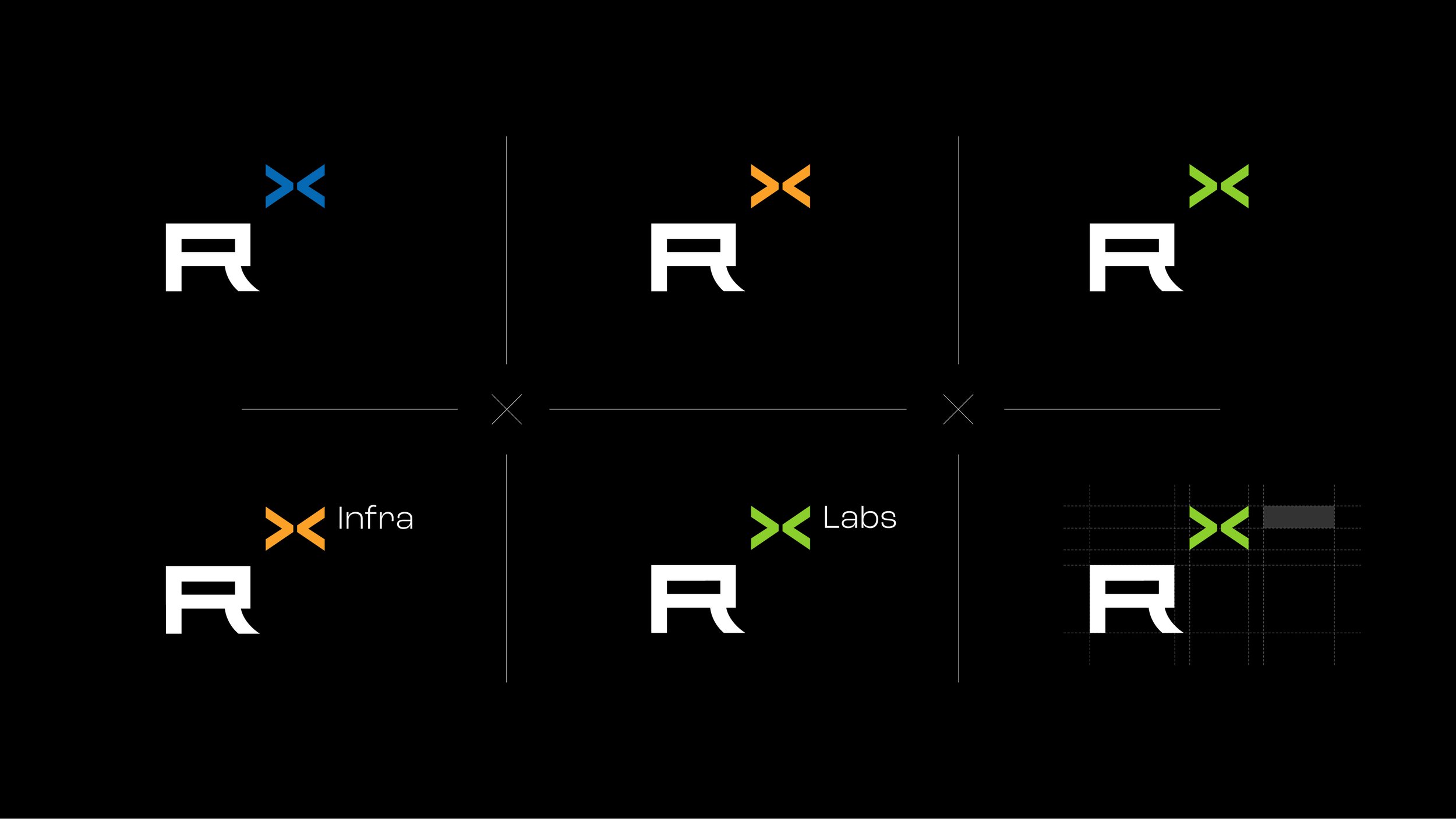
As a company operating in the crypto space, we wanted to create a logo that would tie into this. To do this, we used various coding language in the wordmark. For example, the curved bracket present on the “Y”, the stacked brackets for the “W” and the reductionist “A”.
Most importantly, the “X” in RockawayX is used throughout the design as an exponent – to look like RockawayX.
This concept is applied interestingly across sub-branding and co-branding. For example, RockawayX Labs (their in-house team of engineers who develop blockchain products) would be translated as “Rockaway to the power of Labs”. Or in place of “Labs”, they could insert a co-brand name instead.
Ultimately, the “X” exponent, is a bold graphic component throughout the brand that represents the two sides of the company. The intelligent, mathematical side and the bold and daring – investing in the infinite potential of Web3 – side.
Finally, taking it further, we explored the “X” as an element in various forms, such as rotated, expanded, or one-sided. Then applied a 10x10 grid and white space. This created a nice balance and added some fun to the brand.
The result is a bold fun logo that represents who they are as a company, a brand aesthetic that merges two worlds – investing and Web3 – and a bold graphic statement “Founders madeX” positioning line to reflect their commitment to the exponential growth of their founders.
Creative Director: Sheldon Stewart
Project Manager: Naledi Mokhele and Robyn Miguel
Design: Liam McAlpine
Strategy: Jason Touhy